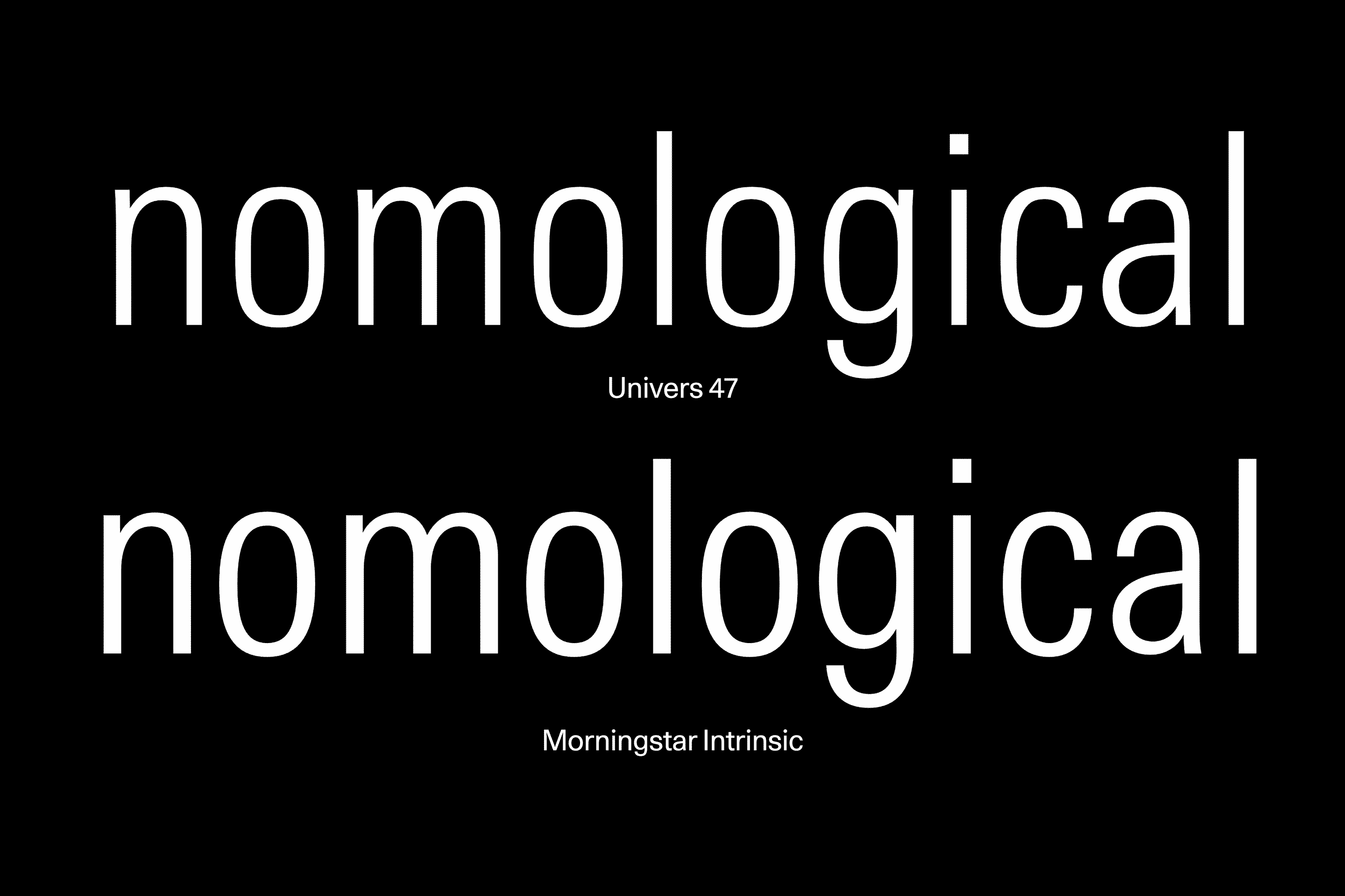
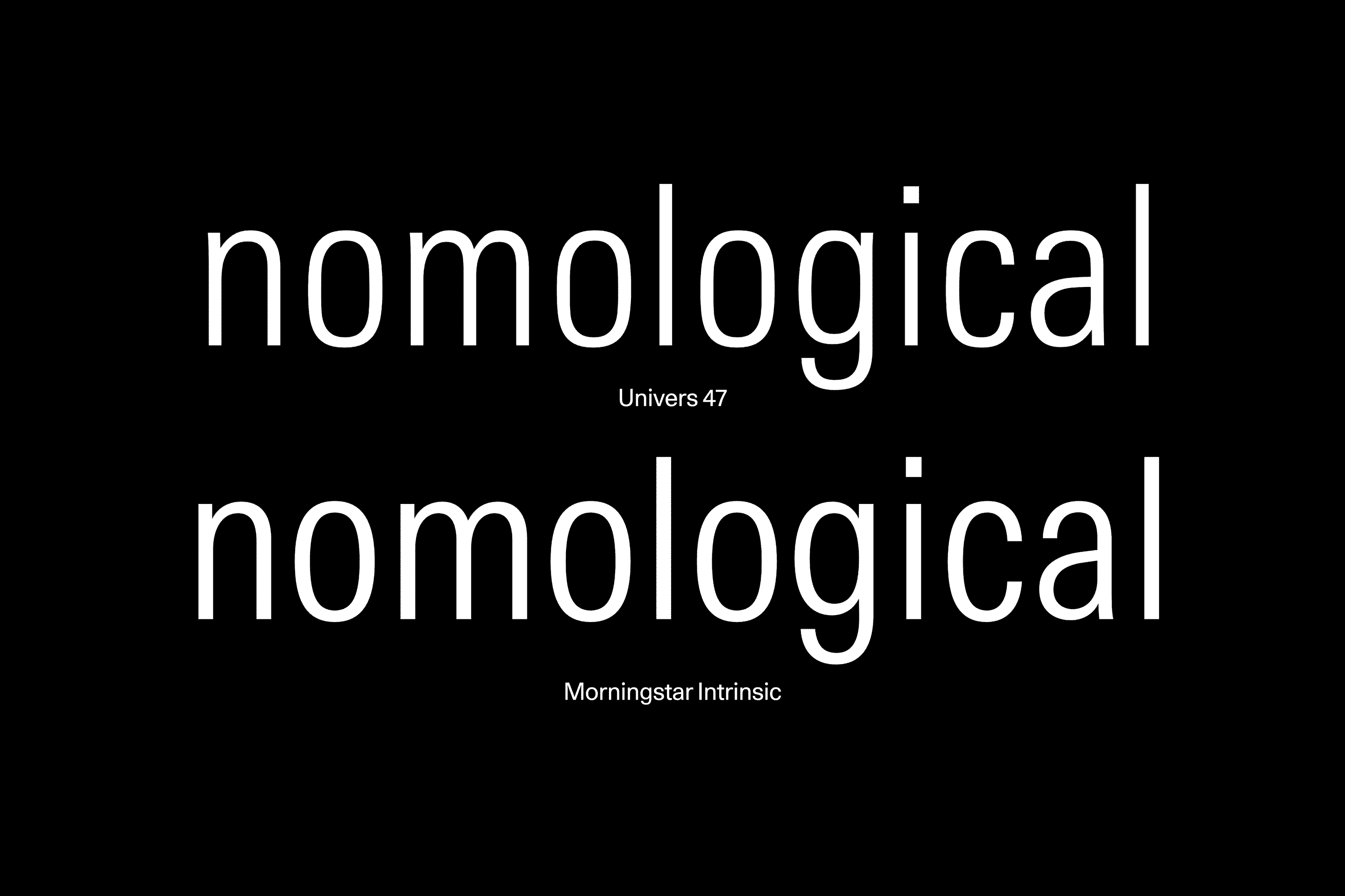
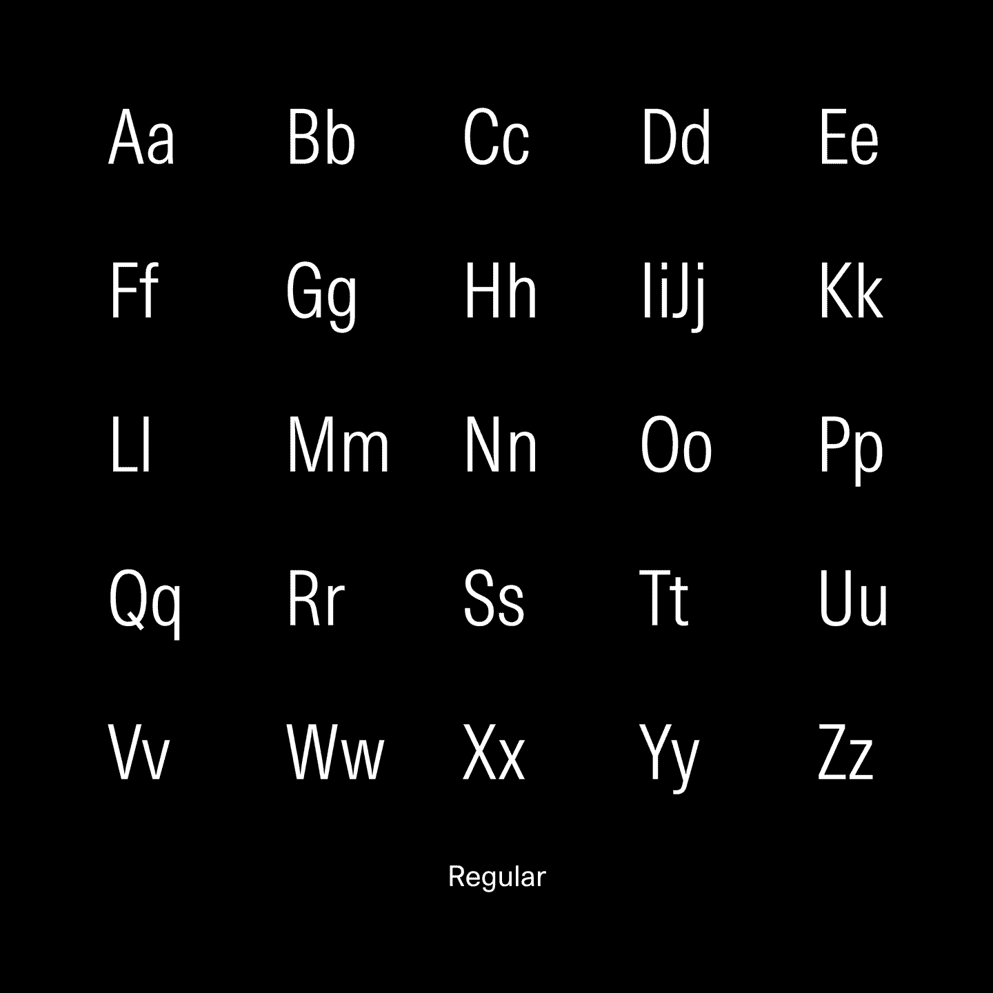
Improved letterforms – The new typeface retains the metrics and look of its precursor. At the same time, legibility was enhanced thanks to a refined rhythm, extended x-height, and micro-edits of tight joints.
Morningstar
Advance and Evolve
A global financial services company looked for an exit from their type licensing contract. We worked closely with their in-house Design Department to tailor-make a new condensed typeface family that respected the tradition of the previous font, while also matching all existing templates in an intricate eco-system of various software and data platforms. Nothing needed to be changed - except the font.
Client Morningstar Inc.
Agency: Morningstar Design Dept., Chicago
Introduced: 2024


Distinct numerals – The numerals, designed for tabular embeddings, were submitted to a series of legibility tests to enhance recognisability. Each numeral can now be clearly distinguished from all the others even under difficult reading conditions.
Seamless transition – The new character shapes blend in with all existing systems of data visualisation, minimising collateral damage across graphs, diagrams, charts, and more.


Images provided by Morningstar. Typographic material, animations and website captures by Lineto.