By Chiachi Chao — The challenge of bi-scriptural typesetting poses significant difficulties for designers and typesetters, who must harmonise various styles across different scripts. Similar tasks have historically been a fundamental responsibility of punchcutters and type designers, and traces of their efforts can sometimes remain visible for centuries. In contemporary Latin typefaces, for example, uppercase characters derive from Roman monumental capitals, lowercase from the revived Carolingian minuscule, numerals from Arabic numeration, and italics from the Chancery hand. This phenomenon extends beyond Latin scripts and is also evident in CJK (Chinese, Japanese, Korean) typefaces, which frequently incorporate multiple languages and scripts.
Kleisch:
Drawing Connections Between Latin Serif and CJK Ming Typefaces
Problem Statement
In bi-scriptural typesetting with CJK Ming and Latin serif typefaces, two practices are most common today: either using the default Latin characters that are often included in CJK fonts, or selecting an existing Latin typeface with similar visual attributes. Unfortunately, both methods lead to unsatisfactory results rather frequently. On the one hand, default Latin characters are often impaired by rough drawing quality and sometimes naïve design decisions resulting from a lack of expertise in Latin type design among CJK Ming designers. On the other hand, it is difficult to find an existing Latin typeface that aligns well with the very different visual parameters, proportions, contrast and grey tone of Ming typefaces.1 Especially in light styles, compatible options are rare.

Acceptable default pairings of Ming with Serif Latin styles.
However, three rather successful examples of default pairings allow for a closer understanding of some of the criteria at hand. For example, Apple LiSung incorporates a particularly light weight of Times New Roman which doesn’t exist in the original family of this typeface. Despite the slight incompatibility due to the bracketed serifs and condensed counters, this combination is quite effective thanks to the generous x-height and high-contrast letterforms of Times New Roman. Similarly, Adobe’s Source Han Serif uses a Latin typeface by Frank Grießhammer, which was based on Pierre Simon Fournier’s model but aligns well with Chinese character proportions thanks to a larger x-height resulting from reducing the extenders. Finally, the Latin characters of Hama Mincho are derived from a new rendering of Pierre Didot’s cut. The stroke contrast matches the Ming typeface well, yet the letterforms convey a distinctly different cultural connotation.
Methodology For a New Approach
When creating a new Latin serif typeface that would offer a fitting and versatile counterpart to CJK Ming typefaces, I set out from two basic assumptions: First, I wanted to avoid unusual shapes originating in CJK typefaces that would compromise legibility in the Latin. Shapes or styles from one script system – if mindlessly transferred – can introduce visual noise in the other and thus disrupt the reading process, as observed by Zuzana Licko: ‘people read best what they are most familiar with.’2
Furthermore, imitating the appearance of one culture’s script in another can result in cultural inappropriateness. For instance, ‘Wonton fonts’ or ‘Bamboo fonts’ are typefaces that mimic the stroke of a Chinese calligraphy brush and are often used for Chinese restaurants or by the early Chinese diaspora in non-Chinese-speaking countries. However, to Chinese speakers, these fonts can be seen as stereotyping and even racist. As recently as 2021, an article on the CNN website noted that ‘for an older generation of Asian Americans, spotting the imitated brushstroke lettering can trigger past traumas.’ 3

Stereotypes in cultural appropriation: Latin character shapes mimick Chinese brush strokes.
In my attempt to find a new method for aligning Latin serif letterforms with Ming, I set out from the observation that both scripts underwent historical processes of rationalisation when they transformed from calligraphy to more geometric modulation. Looking at these transformations in parallel, I assumed, might help to detect some features that became common in both scripts at a certain time. Highlighting such features would then allow to develop Latin letterforms that share with Ming some of their visual parameters and parts of their visual atmosphere, including cultural connotations.

Transitioning from calligraphy to geometric modulation: Ming and serif Latin styles both went through various historical processes of rationalisation.
Rationalisation in Ming Typefaces
The earliest version of the Ming style resembling modern designs appeared in the book Mozi during the Song Dynasty (960–1279), but the style only reached maturity during the Ming Dynasty (1368–1644), when it was introduced for movable type. It was intended to mimic the style of Kaiti, also known as Regular Script, which is the most basic and common upright script in Chinese calligraphy.

Kaiti style typeface (left) and earliest recognisable Ming style from the book Mozi (right).
Over time, the Ming typeface gradually deviated from Kaiti to facilitate the adaptation of handwriting to printing. To ensure that each character fits evenly within a square, the proportions of the Ming typeface became much more rigid and squarish than those of Kaiti. Additionally, the slanted horizontal strokes of Kaiti became perpendicular, and the calligraphic terminals were rationalised into triangular shapes to simplify cutting. Known as uroko in Japanese, the triangular terminals reflect the slight dot created by the subtle pause in brush calligraphy, where the brush momentarily lifts. Yet they can also be compared to triangular serifs in certain Latin typefaces. Despite retaining some traces of handwriting, then, the Ming style eventually evolved to rather strongly diverge from the structure of human hands and its predecessor, Kaiti.

Kaiti style (left); later Ming style adapted for printing (right).
The standardised version of Ming has become one of the most widely used styles for CJK typefaces. While it is often referred to as Ming and sometimes as Song in Taiwan and Hong Kong, it is commonly called Song in China. It is known as Mincho in Japan; and as Myeongjoche in Korea. Ming and Song generally refer to Chinese characters, yet Japanese Mincho includes Hiragana and Katakana, and Korean Myeongjoche comprises both Hangul and Hanja.
Rationalisation in Latin Typefaces
In Europe, the movement of rationalising Latin type started during the 17th century, when punchcutters sought to refine Renaissance types (such as those by Garamond, Granjon, and Le Bé) to make them more compatible with printing technology. They also tried to align their shapes with the rational spirit of the Enlightenment, such as in Romain du Roi (1692), which marked a crucial shift in Western typography, introducing letterforms based on geometric principles, proportional structures, and systematised metrics. Eventually this would lead to the development of modern models of serif types, such as in the ‘Didone’ styles (including Didot and Bodoni), which generally exhibit greater contrast and deviate further from the calligraphic origin of Latin letters.
Among the first to refine the Renaissance models, Baroque styles have recently become recognised as an independent category since the 1960s. They are considered to have originated in the southern Netherlands in 1550, when Hendrik van den Keere of Ghent first broke with the Garamond style, introducing ‘fat-faced’ and ‘large-height’ types.4 Baroque types are furthermore characterised by modulated strokes, large x-heights, variable axes, contrasty serifs, and lachrymal terminals. These features can be observed in designs by Nicholas Kis, Christoffel van Dijck, John Fell, and William Caslon, among others.

Baroque styles: Van Dijck, Ascendonica (left); Kis, Clein Canon (right).
Robert Bringhurst distinguishes the Baroque from the later Neoclassical models, which start with Romain du Roi, in his study The Elements of Typographic Style.5 While both models share basic construction principles such as modulated strokes and typical features like the lachrymal terminals, the Neoclassical character shapes exhibit an even more rational structure with stress on the vertical axis and moderate apertures. Contrast is often more pronounced with strokes already coming close to the expansion model later created with point nibs (see the chapter ‘Matching stroke models’ below). The Italic harmonises with the Roman counterpart. This category of Neoclassical typefaces is often associated with the works of Pierre-Simon Fournier, John Baskerville, and Joan Michaël Fleischman.

Neoclassicism: Fleischmann, Augustyn.
Where to Start?
Considering the trajectories of rationalisation in Ming and Latin serif typefaces in parallel, I started to look for points of mutual exchange and alignment between the two. While the properly modern ‘Didone’ styles are also frequently used alongside Ming, I opted for focusing on the earlier Baroque and Neoclassical models. These are more similar to Ming in that they are also representing a synthesis of contrasting design approaches, still reflecting hand movements while also integrating elements of character shapes that diverge from traditional tools such as brushes and nibs. In my view, ‘Didone’ styles also align less well with Ming culturally, as they lack humanistic traits and imply luxury.
Examining many typefaces from the Baroque and Neoclassical periods, I found that most of them complement well with Ming in certain aspects, yet they also contrast in other regards. For example, the Baroque model, including the work of Kis and Van Dijck, aligns more closely with Ming in visual ambience due to its calligraphic residuals. Meanwhile, the rational construction of the Neoclassical model (Fleischman, Fournier, and Baskerville) offers improved proportions and contrast when compared to Ming.
An unexpected discovery of a typographic composition by the late Taiwanese artist Huang Hua-Cheng eventually hinted into a promising direction. It featured a modified cut of Caslon with reduced extenders, paired with a medium weight of Ming. The lachrymal terminal of the lowercase ‘a’, the strong contrast in the serifs, and the movement of the terminal in ‘e’ created a harmonious pairing alongside Ming.

Poster design by taiwanese artist Huang Hua-Cheng employing a modified style of Caslon.
This discovery prompted further exploration of work by William Caslon I, who cut Roman types based on Dutch Baroque as late as 1722, aiming to adapt 17th-century type for the 18th century. In comparison to Neoclassical cuts by Fournier, Fleischman, and Baskerville from the same time, Caslon’s type exhibits a relatively organic quality, resembling handwriting. Inspired by these letterforms combining Baroque and Neoclassical models, I decided that my new typeface should also blend the Baroque model with the rational clarity of the Neoclassical era, synthesising key features from both styles. After a thorough analysis of historical sources for the two models, I settled on Baroque cuts by Van Dijck and Kis as the primary sources for defining the general features of the new letterforms.

Van Dijck design that served as a starting point for the development of Kleisch.
As a secondary source, I used Fleischman’s Augustyn Roman as the main reference for the proportions, due to its generous x-height and balanced counter space. Several other typefaces from the hands of Caslon and Fell were also sampled to ensure selecting the most accurate individual features of each letterform for pairing with Ming.

Fleischman design used as reference for the proportions of Kleisch.
Matching Stroke Models
To establish a relationship between Latin serif and Ming in terms of stroke models, it is helpful to consider Gerrit Noordzij’s theory of strokes, which distinguishes a translation model from an expansion model. The translation model is produced by broad nibs and is characterised by the two fixed points of the nib, which Noordzij refers to as counterpoints. In contrast, the expansion model is created by point nibs, with the stroke width determined by the changing expansion value of the two symmetrical points of the nib.6

Translation model of strokes resulting from use of broad nibs (top), and expansion model from point nibs (bottom), according to Gerrit Noordzij.
To analyse the stroke logic of the Ming style within Noordzij’s theory, one could observe that the strokes exhibit characteristics of both models. This is because the tool used in CJK calligraphy is neither a broad nib nor a point nib, but rather a brush. As a result, the size of the stroke in CJK writing is determined by the pressure applied, akin to the expansion model from point nibs, while the form of the stroke possesses a unique shape that indicates path direction, similar to the translation model.

Stroke model of Ming style, blending translation and expansion models.
Generally, the ‘old-style’ Latin types from the Venetian to Renaissance periods are based on the translation model, whereas modern typefaces are developed from the expansion model. Baroque and Neoclassical types often blend both models, leading to certain arbitrary features. Many Baroque typefaces display traits of both models, particularly those designed by Van Dijck and Kis. For example, while the top terminal of the Garamond ‘a’ originates from the cut point of the quill, the same letter in Kis’ type has an arbitrarily formed geometric circlet. Additionally, the flat serif (with almost no brackets) and the upright stress of the ‘o’ are also indicative of the expansion model. However, the translation model still predominates in the strokes of letters, especially in the shoulders of ‘h’, ‘n’, ‘a’, and in the bowls of ‘b’, ‘d’, ‘p’, and ‘q’. In my new typeface, I used the geometric terminals and translation strokes as distinctive characteristics originating from Kis.
Matching Ductus and Writing Tempo
Letterforms are shaped not only by the tools but also by the way they are written, often referred to as ductus. Chinese calligraphy features a distinct ductus in which most strokes terminate with a return motion, resulting in the formation of geometric features such as triangular-shaped terminals (lín), beak-like hooks (gōu), and returning strokes (zhé).

Beak-like hooks (gōu) in Chinese calligraphy.
This characteristic ductus, marked by a pause or return in the stroke, is also evident in typefaces cut by Fleischman, particularly in the vertical serifs seen in letters such as ‘E’, ‘F’, and ‘L’, as well as the top terminals of ‘n’, ‘m’, ‘d’, and ‘h’, which bear a resemblance to Ming. The terminals and serifs in Fleischman’s work have thus been incorporated into the design of my typeface, allowing it to reflect the fluidity of movement in Chinese calligraphy while preserving its Latin typographic roots. This approach achieves a harmonious visual unity that complements Ming typefaces well.

‘E’ shape from Fleischmann displaying vertical serifs with bear resemblance to beak-like hooks in Chinese.
The tempo at which letters are written is also a crucial factor in determining the final letterform. In Chinese brush calligraphy, the writing speed often changes within a single brush stroke. In Latin calligraphy, letters are generally written at a rather steady pace. However, some typefaces from the Baroque and Neoclassical periods indicate changes in writing tempo as well, particularly at the bottom terminals of the letters ‘a’, ‘c’, and ‘e’. This characteristic is especially evident in the Ascendonica Romein cut by Van Dijck, and in Kis’ Clein Canon Romein. It was further highlighted in Fell’s type, which was heavily influenced by Van Dijck. Modern revivals of Kis’s and Van Dijck’s work tend to eliminate these features, as can be seen in a Monotype revival of Von Dijck, for example. Kleisch returns to the original shape and dynamic of the terminals, as this helps to achieve harmony with the Ming style.

Speed changes are visible in terminals drawn by Kis and Van Dijck (left). The shortened terminals in a Van Dijck revival by Monotype loose the characteristic ductus (right).
Matching Proportion
Next to individual features of the letterforms that determine the visual parameters and atmosphere of the Ming and Latin typefaces, proportions are also key for aligning the two scripts. Unlike Latin characters, which have ascenders and descenders, Chinese, Japanese, and Korean (CJK) characters are constructed within a square framework, giving them a visual similarity to Latin capitals.

Square framework typical of CJK characters; Latin capital letter.
In Latin typefaces, visual size is largely determined by the relationship between the x-height and the extender height. A Latin typeface with a large x-height generally pairs more harmoniously with CJK typefaces, as it achieves a more balanced visual proportion. Historically, extenders were reduced in the shift from Garamond to the Baroque period. This first appeared in the work of Hendrik van den Keere in the late 16th century, and similar proportions were adapted by Kis and Van Dijck. The x-height was even further increased in Fleischman’s Neoclassical model, which was specifically designed for small sizes.
In modern revivals, however, the ascenders were often lengthened to fit the aesthetics of the early 20th century. An example for this can be found, again, in the Monotype revival of Van Dijck. In my typeface, I restored and synthesised the original proportions found in Fleischman’s and Kis’s work, to create a more visually balanced appearance when set alongside the Ming style.

Typical Baroque extender length in Van Dijck (left), and altered according to early 20th century tastes in a Van Dijck revival by Monotype (right).
Fine-Tuning Individual Letterforms
The ‘a’ in Kleisch synthesises elements from Van Dijck, Kis and Fleischman, featuring a top-heavy proportion and a slightly tilted shoulder of Baroque types. The top terminal is rendered with subtle ambiguity between broad nib and expansion nib.

The ‘n’ of Kleisch draws from two models: Fleischman’s dynamic top serifs (also in ‘m’, ‘h’, ‘d’, etc.), reflecting the flexible nib akin to Chinese brush strokes, and Baroque-inspired, high-contrast, bracketless serifs that echo the crisp details in Ming typefaces.

The Baroque ‘s’ is characterised by a slight rotation of the nib on the lower stem, a feature typically softened in the Neoclassical period. The ‘s’ forms in Kis and Van Dijck are marked by asymmetrical terminals. Baroque-style contrast is preserved in Kleisch, while the terminals align with the Neoclassical tradition.

The design of the curved crossbar in Kleisch’s ‘A’ pays homage to the distinctive ‘A’ found in Ehrhardt MT (a renowned Kis revival from Monotype). This feature likely originates from the ‘A’ in Kis’s Goote Text, allowing additional room in the restricted counter space limited by the high crossbar.

During the Baroque and Neoclassical periods, a more dynamic ‘C’ emerged in Roman capitals, influenced by Italic forms and seen in the work of Fleischman and Kis. With its abrupt stroke termination, this form shares a visual trait found in CJK calligraphy, and it inspired the design of the ‘C’ in Kleisch.

The design of the vertical serifs is a key feature of Kleisch, inspired by the spiky serifs of Fleischman, which echo the returning strokes in Chinese calligraphy. However, Fleischman’s style felt too flamboyant alongside Ming type, therefore the serifs were simplified to align more closely with the styles of Kis and Van Dijck.

The ‘M’ is an important indicator to reveal the identity of a serif typeface. In Neoclassical types, the stems of the ‘M’ are generally vertical, while in Baroque types, they tend to tilt inward. The final design decision for Kleisch’s ‘M’ places it closer to its Baroque roots.

Kleisch’s italic was designed in the Baroque fashion, with inconsistent stem angles, condensed proportions, and a lively, fast writing style. The crossbar in the italic has a slight slant, adding vibrancy to the overall texture.

Variable Weight and Contrast:
Matching Grey Tone
Matching the grey tone in trans-cultural typesetting of Ming and Latin is challenging. Even with a large x-height in the Latin typeface and a slightly reduced character size in the Ming typeface, Latin characters often appear lighter in comparison due to the complex stroke construction in CJK scripts, especially Chinese. Since many Ming characters use significantly more strokes than Latin ones, they appear darker when the stroke width is even. This effect is less noticeable with larger type sizes, as the human eye tends to shifts focus from overall greyness to stroke thickness if the characters are larger. For this reason, using slightly thicker Latin stems can help achieve a more balanced visual greyness for text and caption sizes, while even stroke width is generally recommended at larger sizes.
To enable for continuous adjusting of the stroke width, I decided to build my typeface with two variable axes for weight and contrast. This allows for a refined adjustment of the grey tone, depending on the style of the respective Ming typeface used in the pairing. As a consequence, Kleisch performs very well in pairings with a large variety of Ming typefaces in various weights. One way of assessing the achievement is to compare Kleisch with the default Latin characters currently found in the Ming typefaces.
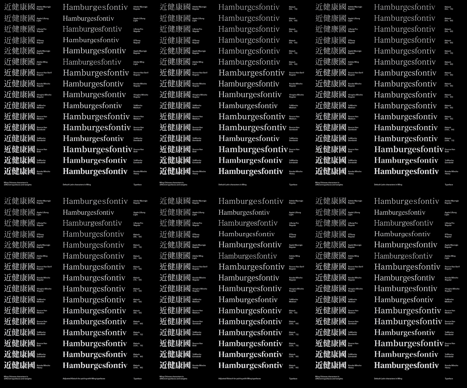
In another series of tests for the versatility of Kleisch, I combined various instances in a sample layout with bi-lingual text setting. In each case, weight and contrast were fit to match the the grey-scale of the respective typefaces, including Apple LiSung Light, Toppan Bunkyu Mincho Regular, YuMincho Demi Bold and Source Han Serif TC Heavy.

These criteria are derived from Japanese typographer Mariko Takagi’s presentation in Wittner, 284.
Licko.
Quito.
Vervliet, 38.
Bringhurst, 12–13.
Noordzij, 7.
BIBLIOGRAPHY
Bringhurst, Robert. The Elements of Typographic Style, Seattle, WA: Hartley & Marks, 1992.
Licko, Zuzana. ‘Zuzana Licko on Design and Legibility’. Emigre no. 11 (1992).
Noordzij, Gerrit. The Stroke: theory of writing. London, UK: Hyphen Press, 2006.
Quito, Anne. ‘Karate, Wonton, Chow Fun: the end of “chop suey” fonts’. CNN, https://edition.cnn.com/style/article/chop-suey-fonts-hyphenated/index.html. Accessed December 2024.
Vervliet, Hendrik D. L. French Renaissance Printing Types: a conspectus. New Castle, Del.: Oak Knoll Press, 2010.
Wittner, Ben, Sascha Thoma, and Timm Hartmann, eds. Bi-Scriptual: typography and graphic design with multiple script systems. Sulgen, Switzerland: Niggli, 2018.
December 2024. Copyright © 2024 by Chiachi Chao & Lineto. All rights reserved.